
Risk graph
The risk graph plots a trade’s P&L against the underlying’s price, so one picture shows where the trade makes money, where it loses, how much of that changes by tomorrow, and what a jump in implied volatility does to it.
The Expiry curve is the P&L at the front expiration. T+0 is the P&L now, and the other T+ lines fall between now and the front expiration’s close. A plotted scenario gets its own curves. The toolbar sums up the curve in focus: the active scenario’s, else the position’s, else the first plotted scenario’s.
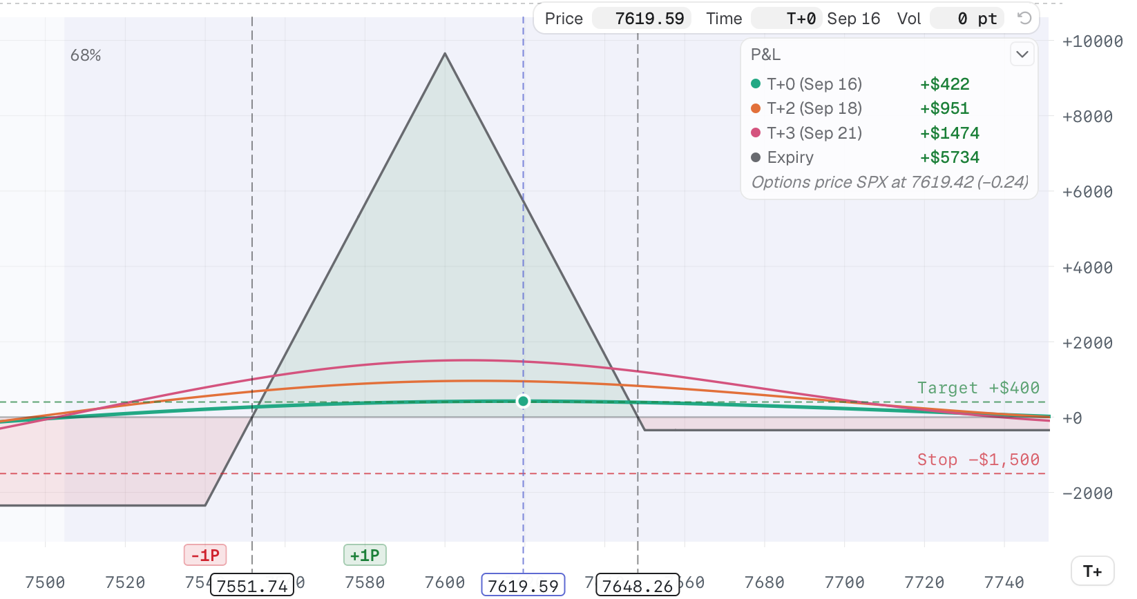
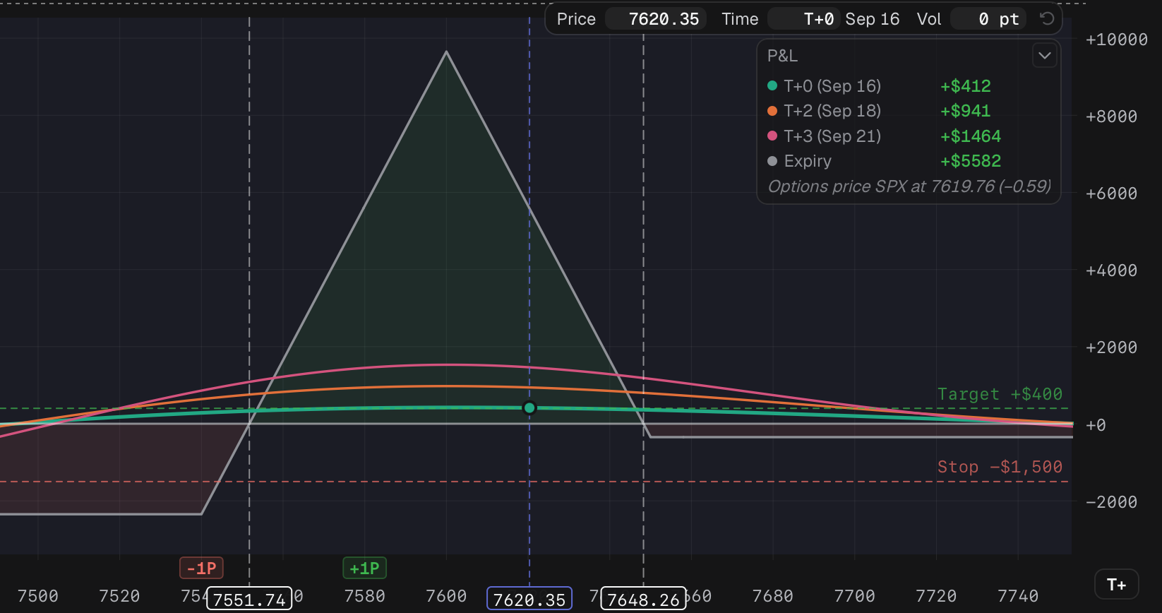
The put BWB's graph: curves, legend, projection strip and the plan's Target and Stop lines.
- 1 Price, Time and Vol what-if
- 2 P&L of each curve at that price
How traders use it
Section titled “How traders use it”- Check the worst case before you send. Read Max L, the break-even marks on the price axis and the 68% expected-move band together. A short strike inside the band needs managing early.
- See what a day does. Set Time to T+1 or T+2 and read the legend. A broken-wing butterfly flat today often shows most of its gain two sessions out.
- Stress a level you already watch. Type 7,590 into Price, add +3 to Vol and read the P&L there. The Sep 23 BWB’s hedge scenario waits for exactly that price (see Scenarios).
- Move a strike and compare. Drag a leg tab under the price axis.
Articles
Section titled “Articles”- Read the curves and legend: the toolbar figures and what each curve shows.
- What-if price, time and volatility: project the graph, and plan an adjustment at a projected price.
- Lines and layers: how many T+ lines, their spacing and colors, the layers, and the plan’s Target and Stop lines.
- Zoom, pan and measure: zoom the chart and read distances to break-evens and spot.
- Edit legs on the curve: drag a scenario’s leg tab to move its strike.
Related: Probability of profit, Max profit and max loss and How Tented prices options. If the graph does not match your broker, see The risk graph doesn’t match my broker.